You’re spending money on ads. You’re posting on social media. You’re putting in the hours. But your website? It might be quietly killing every lead before they ever reach you.
Here’s the uncomfortable truth: most business websites in 2026 are built to look good in a portfolio screenshot — not to convert visitors into paying customers. And in a world where attention spans are measured in seconds and competitors are just one tab away, a website that doesn’t perform is a website that’s costing you money every single day.
At Hansh Digital, we’ve audited hundreds of websites across India, the US, UK, Australia, and Canada. The same mistakes come up again and again. Here’s exactly what’s going wrong — and what to do about it.
1. Your Website Loads Too Slowly
Let’s start with the number that shocks every business owner we work with: 53% of mobile users abandon a site that takes longer than 3 seconds to load.
Not 10 seconds. Three.
And with Google using Core Web Vitals as a ranking factor, a slow website doesn’t just lose customers — it loses search visibility too. You become invisible before you even get a chance to impress.
Common causes of slow load times:
- Uncompressed, oversized images (the #1 culprit)
- Cheap, shared hosting that can’t handle traffic
- Bloated page builders with excessive code
- No caching setup
- Too many third-party scripts and plugins
The fix: Run your site through Google PageSpeed Insights today. If you’re scoring below 70 on mobile, it’s time for a serious performance audit. The investment pays for itself almost immediately in reduced bounce rates and better rankings.
2. Your Homepage Doesn’t Answer the Three-Second Question
When a visitor lands on your website, they unconsciously ask three questions in the first three seconds:
- What is this?
- Is this for me?
- What do I do next?
If your homepage doesn’t answer all three instantly — with clear, plain language — they’re gone.
We see this constantly: beautiful websites with hero sections that say something like “Empowering Synergistic Solutions for Tomorrow’s Business Landscape.”
Nobody knows what that means. And nobody stays to find out.
What your homepage needs above the fold (before any scrolling):
- A headline that says exactly what you do and who you help
- A one-line sub-headline explaining the outcome you deliver
- One clear call-to-action (not three — one)
- Immediate visual proof that you’re credible (client logos, a stat, a photo of real work)
Simplicity isn’t dumbing it down. It’s respecting your visitor’s time.
3. You Have No Clear Call-to-Action Strategy
Most websites we audit have one of two problems: either there’s no call-to-action at all, or there are so many that visitors don’t know what to do first.
Decision paralysis is real. When someone can “Book a Call,” “Download a Guide,” “Watch a Demo,” “View Our Portfolio,” and “Subscribe to Our Newsletter” all from the same page — they often do none of the above.
The fix: Decide on a primary conversion goal for each page. Every page should have one dominant CTA that is clear, compelling, and repeated at least twice (once in the hero, once at the bottom). Secondary CTAs should be visually subdued — present, but not competing.
Also: your CTA copy matters enormously. “Submit” and “Click Here” are dead. “Book Your Free Strategy Call,” “Get My Free Audit,” “Start Growing Today” — these convert because they’re specific, benefit-driven, and low-friction.
4. Your Website Isn’t Built for Mobile — It’s Just Scaled Down
“Mobile responsive” and “mobile optimised” are not the same thing. A mobile-responsive website adjusts its layout to fit a smaller screen. A mobile-optimised website is designed with the mobile experience as the priority.
In India, over 78% of internet traffic now comes from mobile devices. Globally, mobile accounts for more than 60% of all web traffic. If your website was designed on a desktop and then “made to work” on mobile, you’re delivering a second-rate experience to the majority of your visitors.
What mobile optimisation actually looks like:
- Buttons large enough to tap without zooming in
- Text readable without pinching the screen
- Forms that are easy to fill on a small keyboard
- No horizontal scrolling
- Menus that are intuitive on touch, not just hover
- Click-to-call buttons prominently placed
Go to your website on your phone right now. If anything feels clunky or frustrating, your visitors feel it too.
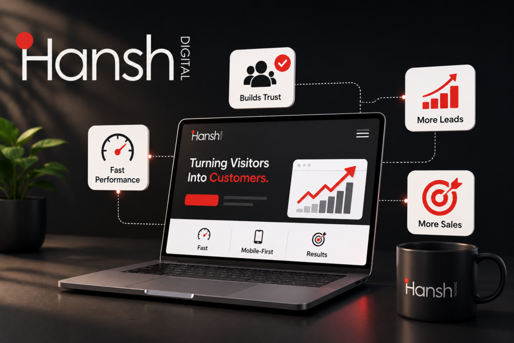
5. You Have No Trust Signals
People don’t buy from websites. They buy from businesses they trust. And in 2026, with scams and low-quality providers everywhere, visitors are more sceptical than ever.
If your website lacks trust signals, even genuinely great businesses get passed over.
Trust signals you should have:
- Real client testimonials (with names, photos, and company names where possible)
- Case studies showing real results with real numbers
- Google reviews or third-party ratings embedded on the site
- A clear “About Us” page with real team photos and your story
- Any awards, certifications, or media mentions
- A physical address and multiple contact options (not just a form)
Visitors are doing a quick subconscious scan: “Is this business real? Are they good at what they do? Has anyone else trusted them?” Your job is to make the answer to all three feel like an obvious yes.
6. Your Website Has No Lead Capture Beyond the Contact Form
A contact form is the most passive, lowest-converting way to capture leads. Most visitors who leave without filling it out are gone forever — you have no way to reach them again.
In 2026, a high-performing website captures leads at multiple stages of the customer journey:
- Top of funnel: A free resource, checklist, or guide in exchange for an email
- Middle of funnel: A quiz, assessment, or calculator that gives personalised results
- Bottom of funnel: A direct booking link for a free strategy call or consultation
When combined with an AI chatbot (see our previous post), these touchpoints ensure that even visitors who aren’t ready to buy today end up in your pipeline — and hear from you when they are.
7. Your Website Isn’t Connected to Your Sales Process
Here’s one that surprises a lot of clients: their website and their CRM have never spoken to each other.
Leads come in through the contact form, land in an inbox, and then get manually entered into a spreadsheet (or just sit in email until someone chases them). There’s no automated follow-up. No tracking of where the lead came from. No way to know which pages they visited or what they were most interested in.
This is a revenue leak. Not a small one.
In 2026, your website should be the starting point of an automated sales engine:
- Form submission → instant CRM entry + automated welcome email
- Chatbot conversation → lead scored and assigned to the right team member
- Booking link used → confirmation email + prep sequence sent automatically
- Page visit tracking → personalised follow-up based on what they looked at
When your website is connected to your sales infrastructure, nothing falls through the cracks. Every lead gets followed up. Every opportunity is tracked.
The Bottom Line: Your Website Should Be Working for You 24/7
Your website is not a digital brochure. It’s not a place to park your logo and phone number. It’s your highest-leverage sales asset — and when it’s built and optimised correctly, it works for you around the clock, even when your team is offline.
The businesses that win online aren’t necessarily the ones with the biggest budgets. They’re the ones whose digital presence is sharp, fast, trustworthy, and designed with a clear purpose: to turn visitors into customers.
If you read through this list and recognised your own website in more than two of these points, it’s time to have an honest conversation about what a redesign or optimisation project could do for your revenue.
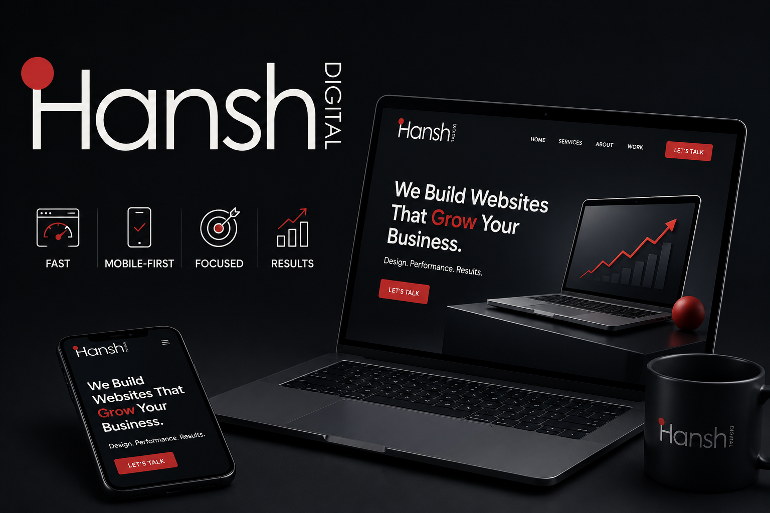
We Build Websites That Actually Convert
At Hansh Digital, every website we design is built with one goal: to grow your business. That means fast load times, mobile-first design, clear conversion paths, trust-building content, and full CRM integration — from day one.
We’ve helped 400+ businesses across India and globally transform their websites from digital dead weight into genuine growth engines.
Let’s find out exactly what your website is costing you — and build you something better.
Written by the Hansh Digital Team | Full-Service Digital Agency | India · US · UK · Australia · Canada